Be Giant
Overview
Be Giant arrived with a clear and urgent mandate: build a credible, ambitious editorial platform for Canada in 60 days. An independent, non-partisan, non-profit media outlet created to uncover and amplify the country's most ambitious ideas, Be Giant set out to report on the thinkers, builders, and problem-solvers shaping the future of Canada with curiosity, optimism, and rigorous journalism.August was brought in as the lead strategic and design partner, working alongside Field Office on development and engineering, and directly with Editor-in-Chief Alison Uncles and Digital Editor Prajakta Dhopade to bring this mandate to life.
We started with the Product Blueprint, locking the content architecture, site structure, CMS decision, and measurement plan. Everything downstream flowed from that foundation.
On the design side, we opened with three distinct directions to give the editorial team uniquely positioned options while sharpening our own thinking. The final system carried the typographic authority of the boldest concept with the content-first architecture the platform needed.
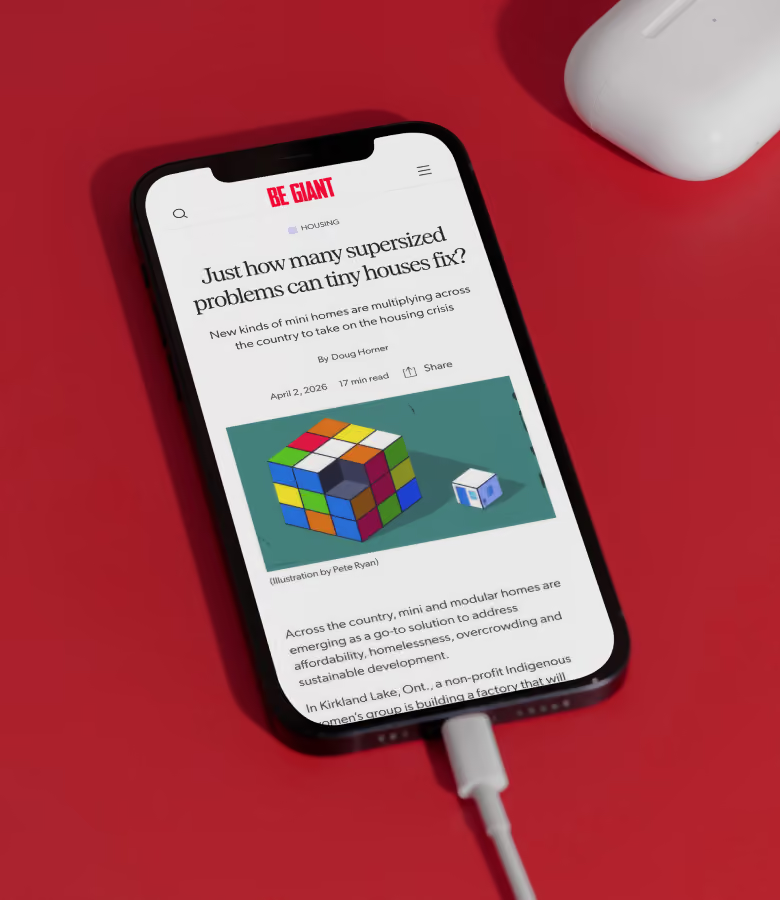
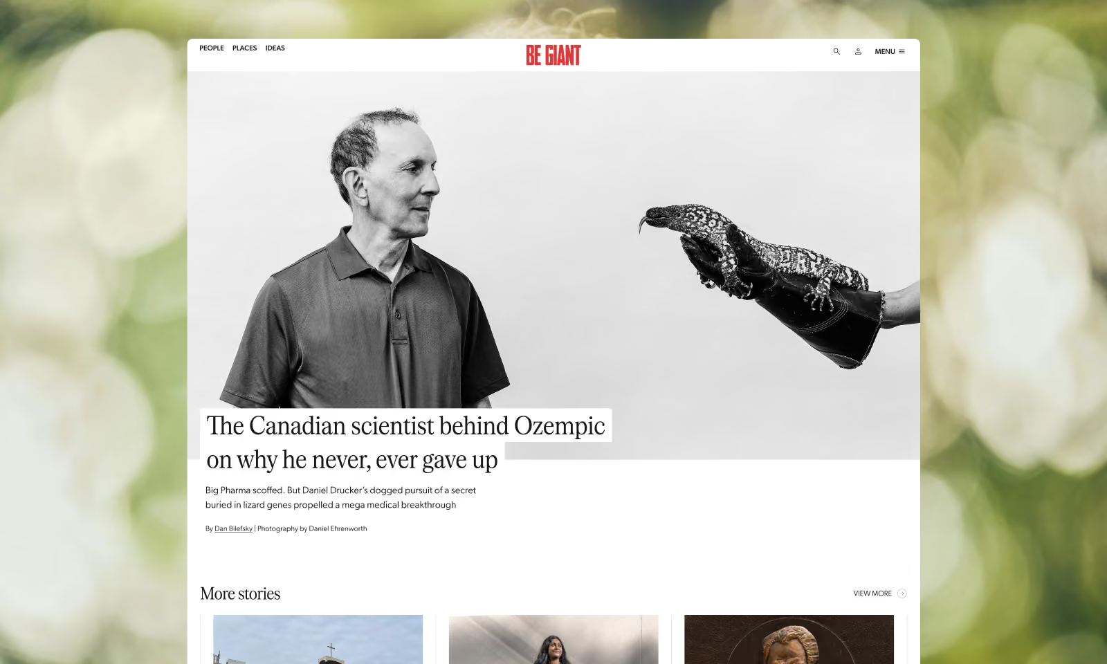
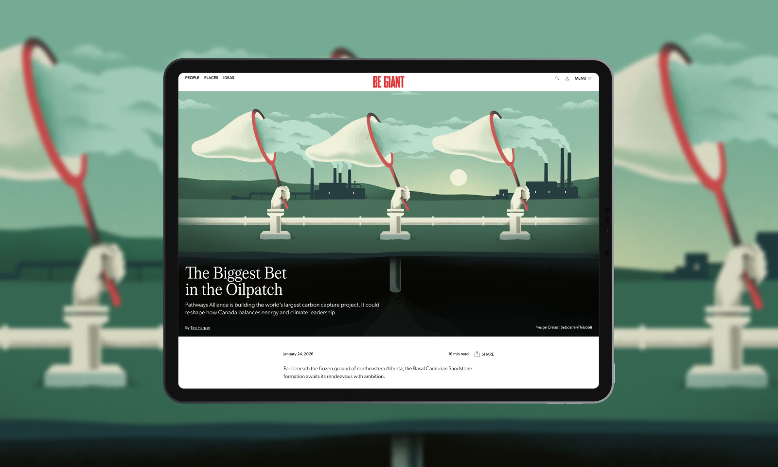
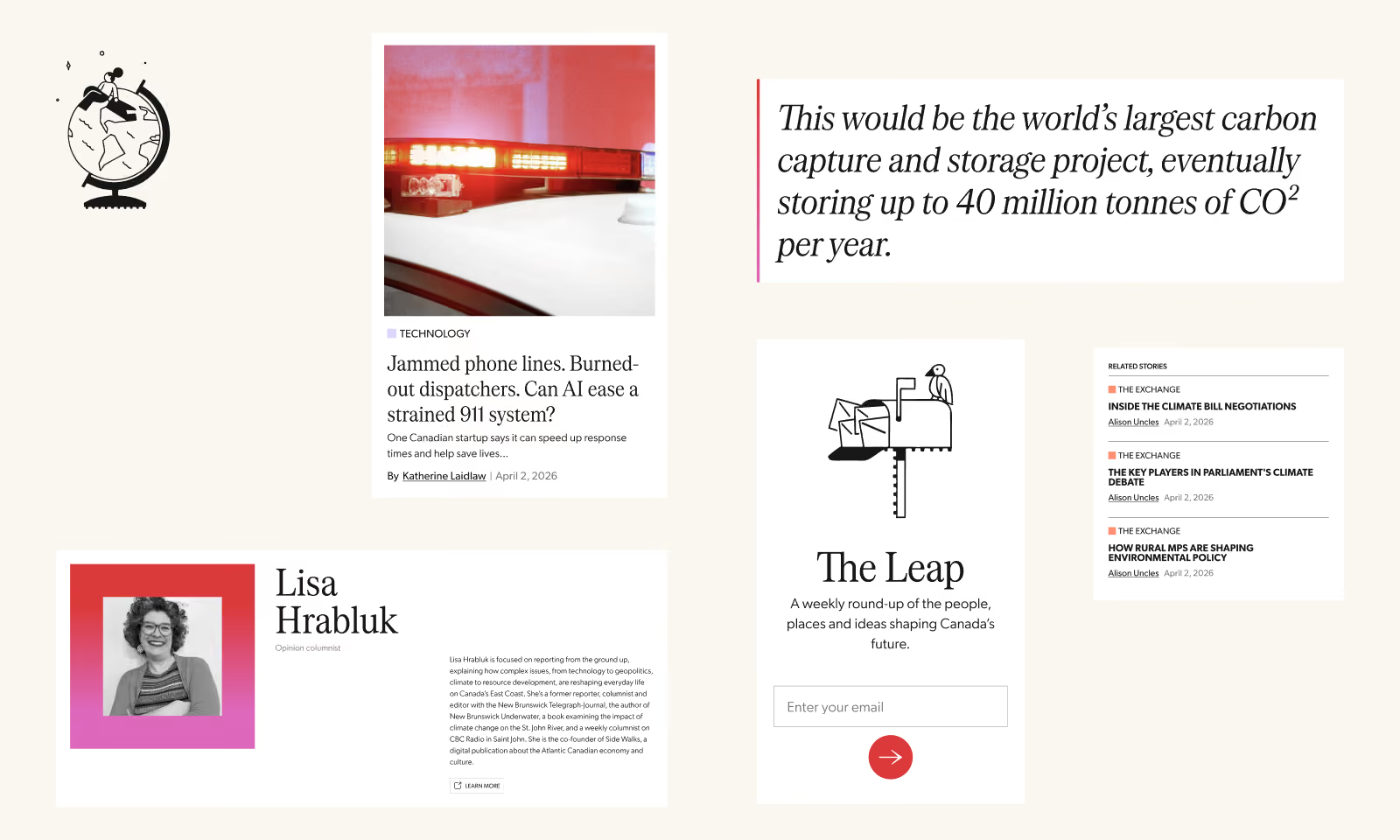
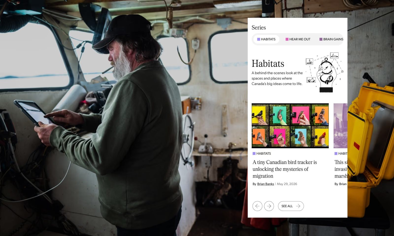
Be Giant was not built as a news site. It publishes considered, well-reported stories, with the intention of engaging a reader fully rather than competing for a click. That editorial philosophy shaped nearly every design decision. Large immersive hero banners give each story the space it deserves. A masonry grid lets the archive breathe without hierarchy becoming a competition. The design gets out of the way and lets the journalism do its job.
Logo: Zulu
Web Development: Field-Office
The Visual Identity
Zulu Alpha Kilo handed us a mark, a typeface direction, and a red. Our job was to take those elements and give them the depth and range a modern digital platform needs, one that could flex across a newsletter, TikTok videos, long-form features, and a social without losing itself.
Systems
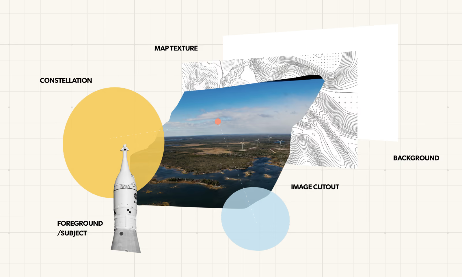
Be Giant is anchored in three pillars — people, places, and ideas — and almost every story is rooted somewhere specific. We built a generator that takes coordinates and produces a topographic line drawing of that location, which becomes the base layer of each cover image. Photography and constellation lines — dots linked by lines, forming patterns that shift depending on the story — layer on top. The result looks considered without being precious, and specific without being literal. We also built a tool to generate constellation graphics at speed, because daily publishing means you cannot hand-craft every asset.
Website
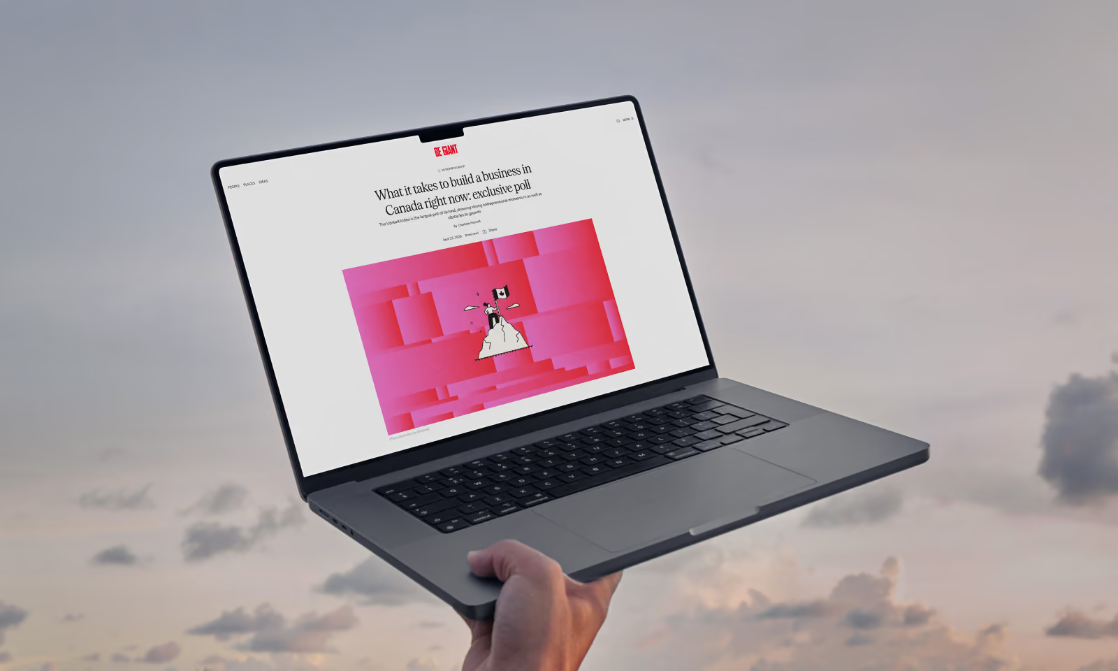
The website was the deliverable. Every decision made laddered up to a new immersive reading exprience. Alongside our friends at Field-Office, who championed the development, we set forth in creating a robost site architecture, one that considered the scale of the team’s ambition and the importance of the stories.

Palette
We kept the bold red and built outward from it, assigning a distinct colour to each of Be Giant's editorial series: warm, bright, slightly unexpected. Purple for one. A burnt orange for another. A yellow that pops. Together the palette reads as optimistic and in a media moment that often defaults to urgency, this is a refreshingly unique take. Colour doesn't show up the same way everywhere. On social media it's full-bleed and loud. Inside an article it's a small accent, a quiet signal that you're in a particular corner of the brand's world.
Illustrations
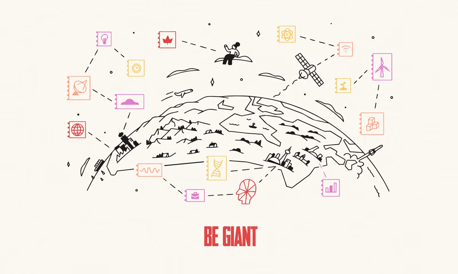
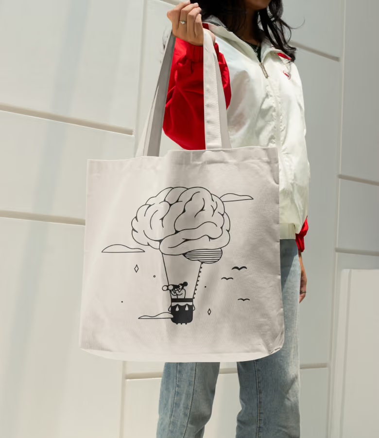
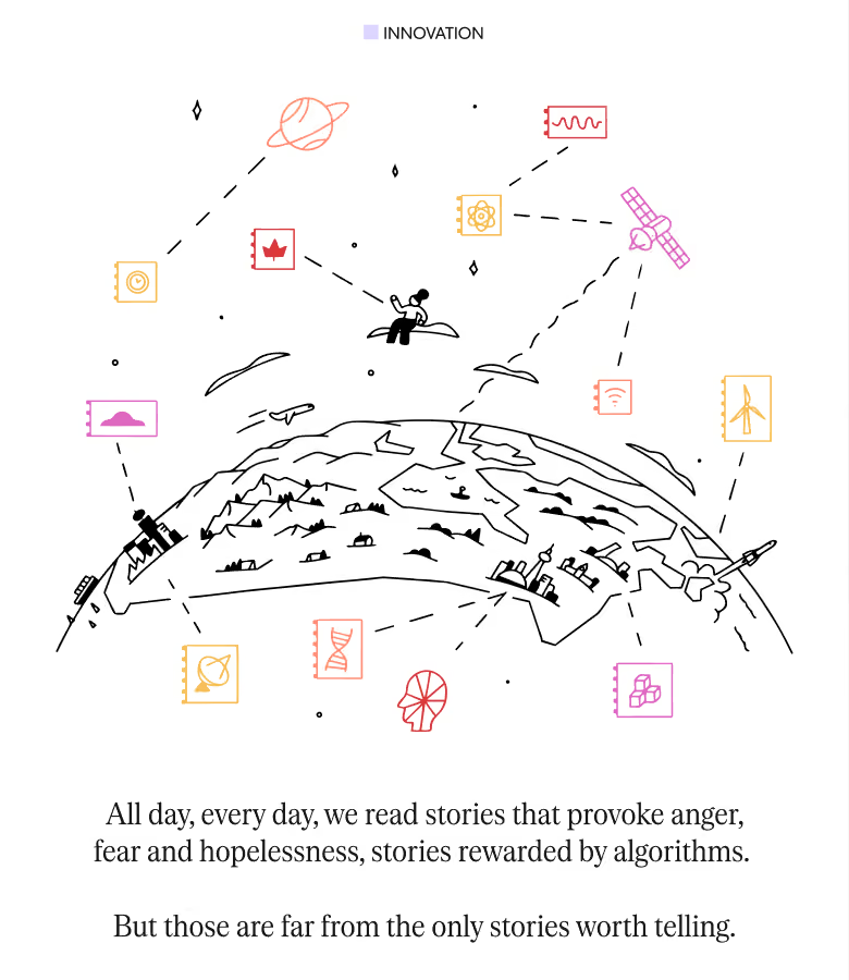
To give Be Giant a visual voice as hopeful as its journalism, we brought in Toronto illustrator Maya Nguyen, whose editorial work has appeared in The New York Times and The Globe and Mail. Maya created a library of line illustrations that runs through the whole site, from the hero globe to the spot art for each recurring series. Her work plays on the name itself. Small figures stand beside outsized objects, perched on a globe, steering a hot-air balloon lifted by a brain, calling out through a megaphone three times their height, so every illustration stages a person taking on something giant. That shift in scale carries the editorial idea of Canadians behind ambitious ideas, and it gives each franchise a scene of its own that reads as Be Giant at a glance across the site, the newsletter and social.
Typography
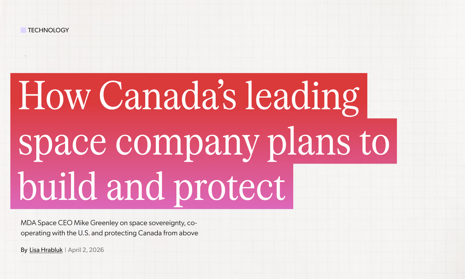
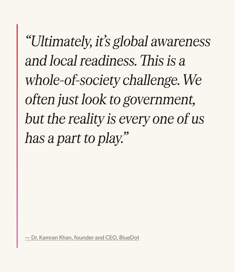
Be Giant’s voice needed to flex between different tones, from approachable and modern on social to credible and serious on long-form. We also know that editorial headlines are unpredictable; some are short and punchy, some run long and complex. We landed on a pairing of Serrif Condensed and Gibson. On headings, Serrif, a workhorse serif built to stay legible under pressure, at display sizes, credible yet modern flair while Gibson can do the heavy lifting on body copy and in occasion on headings for an extra digital feeling.
Social Media
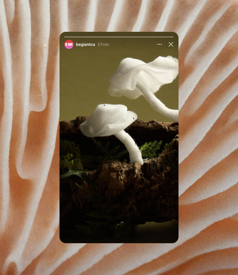
From the start, a strong social presence was one of Be Giant's key measures of success. Reaching new audiences where they spend most of their time, and engaging them with stories and visuals in a fresh way, was critical to the launch. Our evolution of the identity into these channels carried that thinking through, with a series of templates that help the team reinforce the brand consistently, create thumb-stopping visuals and stand apart from the sameness coming out of legacy outlets. Social is where the gradients are pushed furthest, type choices are made with care, and movement becomes central to how the brand shows up.
Collage system
Editorial stories are often hard to illustrate. Articles can cover ideas that don’t yet exist, places that are hard to reach or innovations that are difficult to capture. For all those reasons, Be Giant needed a system of covers that could easily be assembled in a pinch. To help, we developed a series of layers that can be juxtaposed to create compelling story main art.
We developed a way to create bespoke topographic maps of the places where the story get’s told, content placeholders, Be Giant dots (which we named constellations) and foreground elements.
The result is a system that is hyper flexible and lets the story elements shine through.

Digital Editor
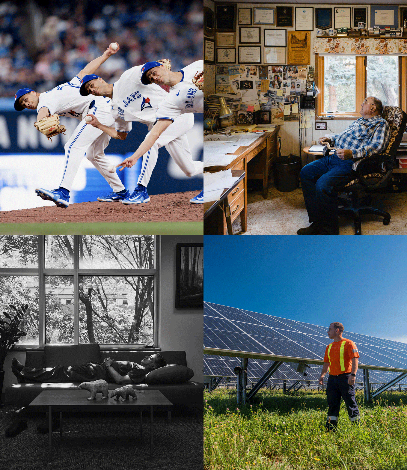
As part of our ongoing engagement with the Be Giant team, we’ve help shape and craft several impactful stories that have reached thousands of Canadians from coast to coast. The range of visuals shows the depth of journalism while always centralizing on opportunity and optimism. The main art tells a story, hooks the reader but most importantly, helps to bolster the sense that our nation has great people, in great places doing great things.