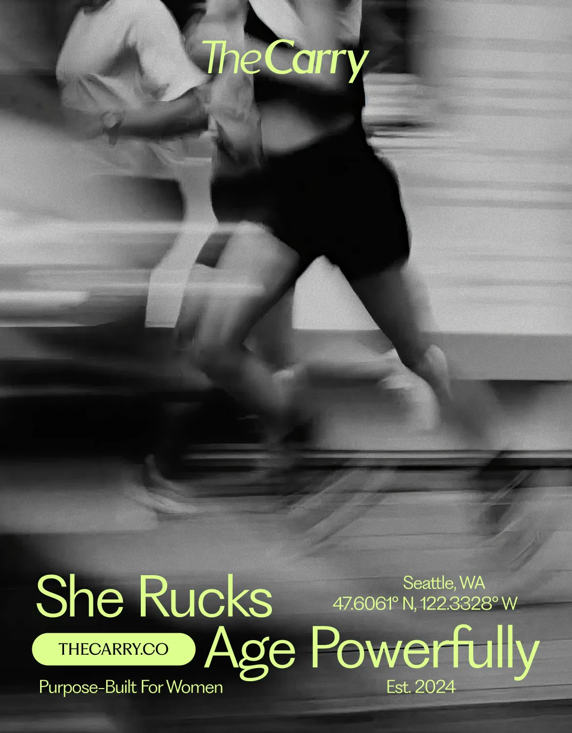
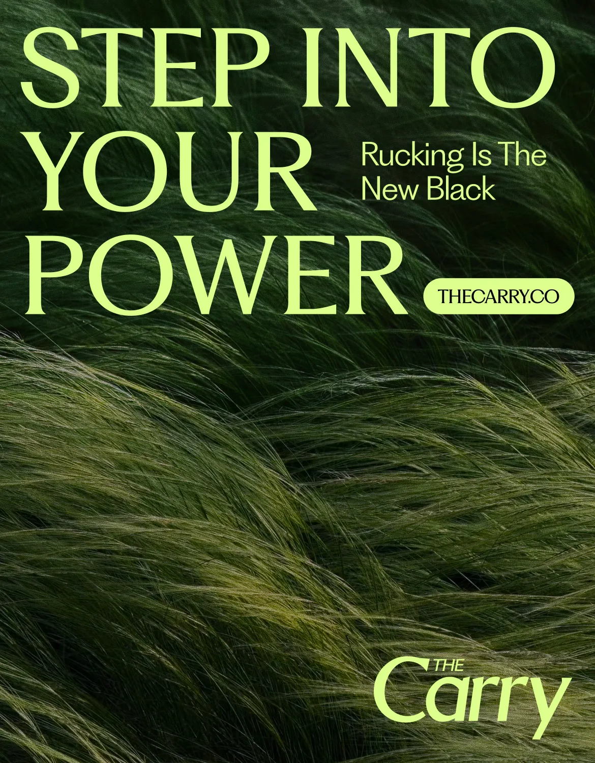
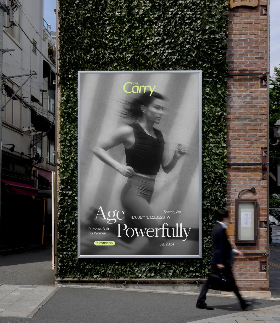
The Carry
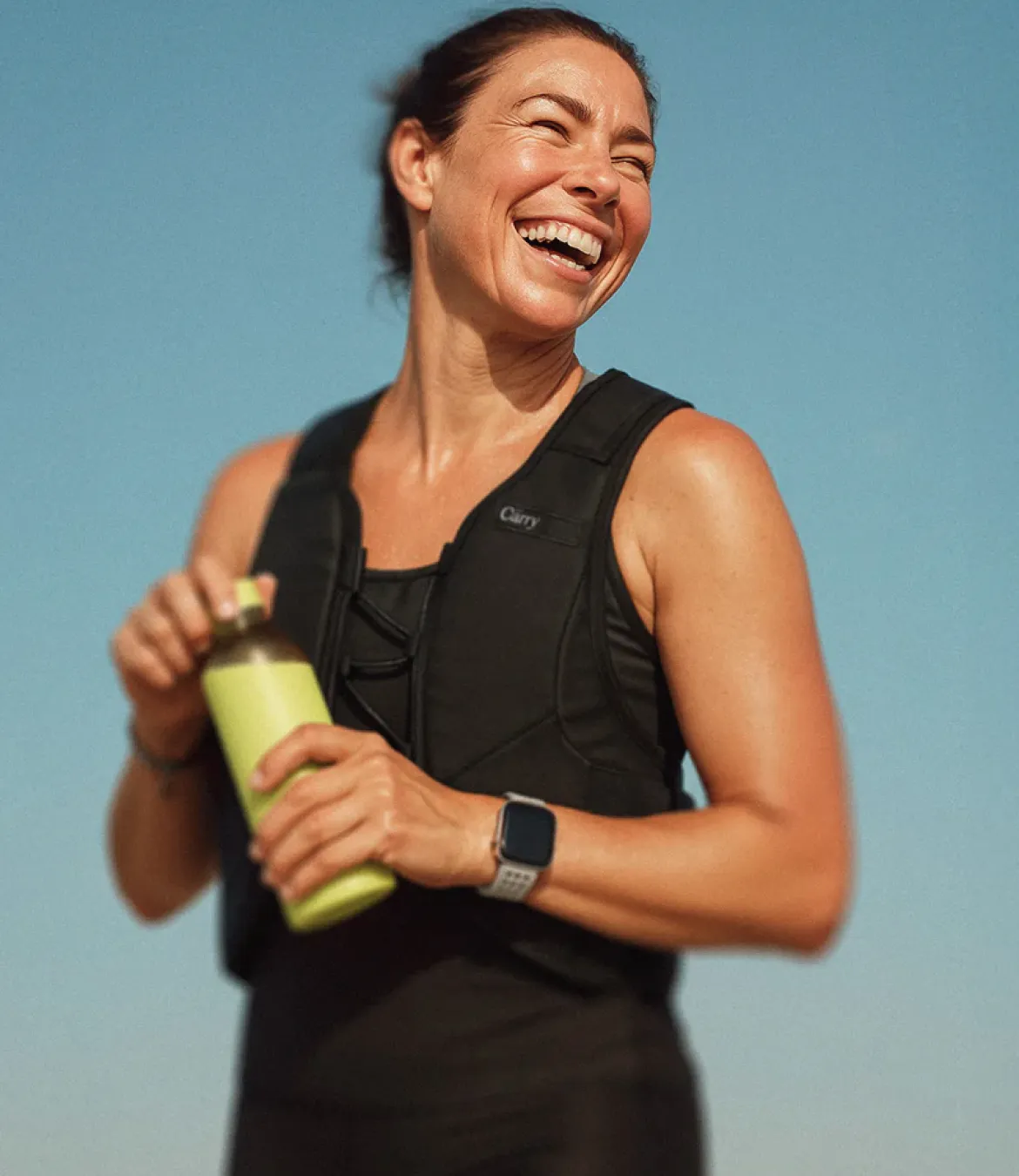
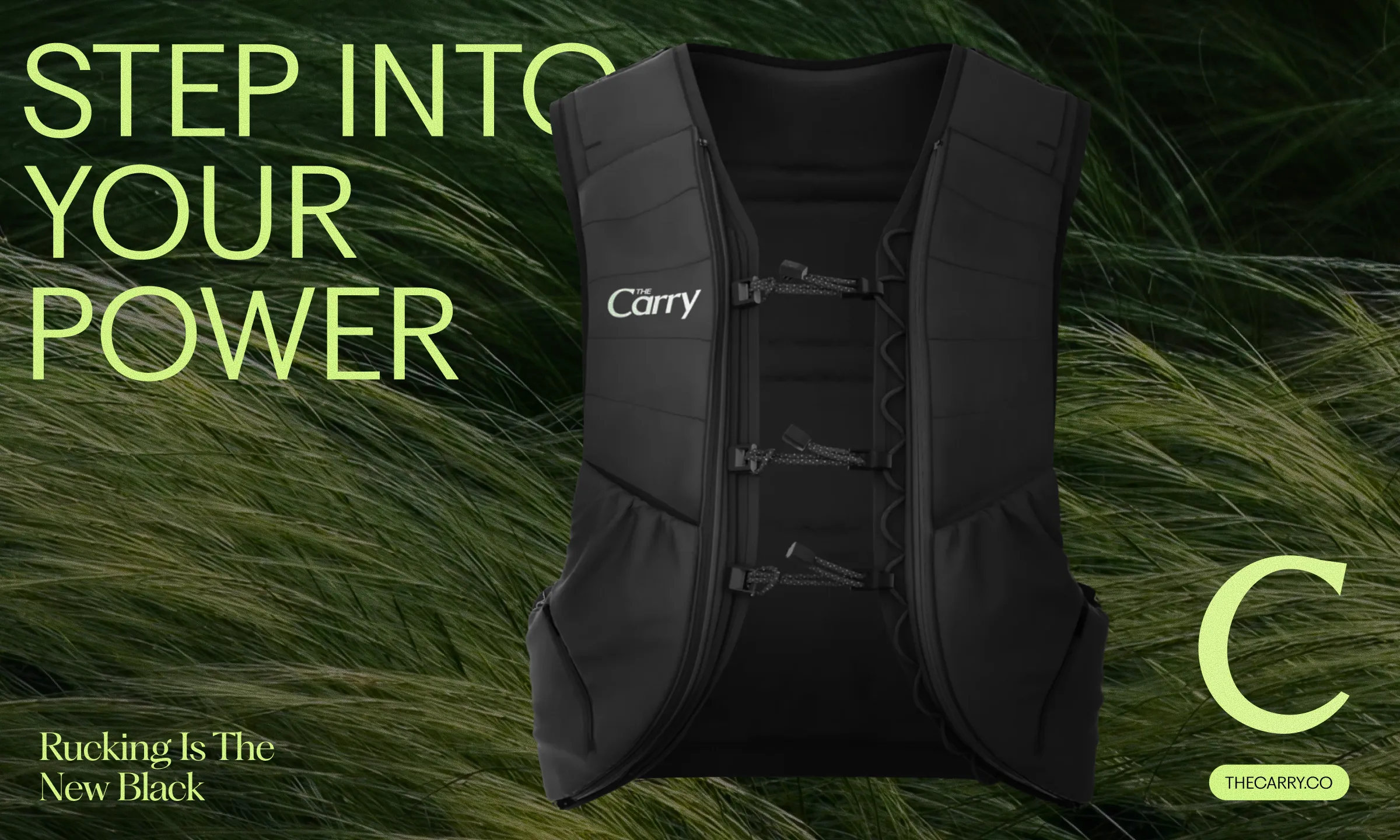
Ambitious founders Cortney and Esther were preparing to launch The Carry - the first weighted vest and rucking brand built entirely for women, by women. The brand seeks to redefine a category that’s long overlooked the needs of women, and their flagship product - a weighted vest - helps women build strength, boost bone density, and support longevity. They approached August to help them elevate their brand identity and build their Shopify site in time for their pre-sale launch in the Summer of 2025.
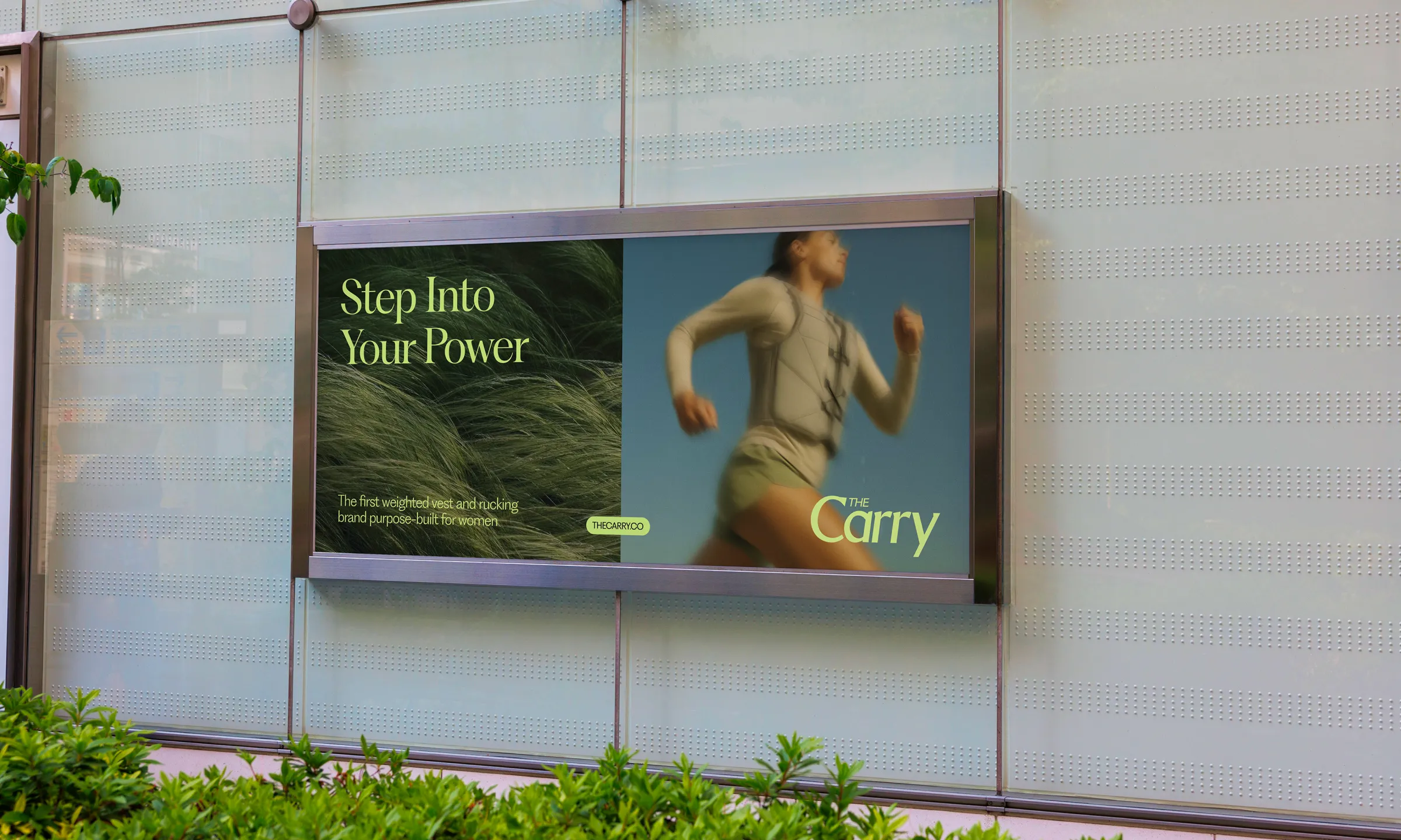
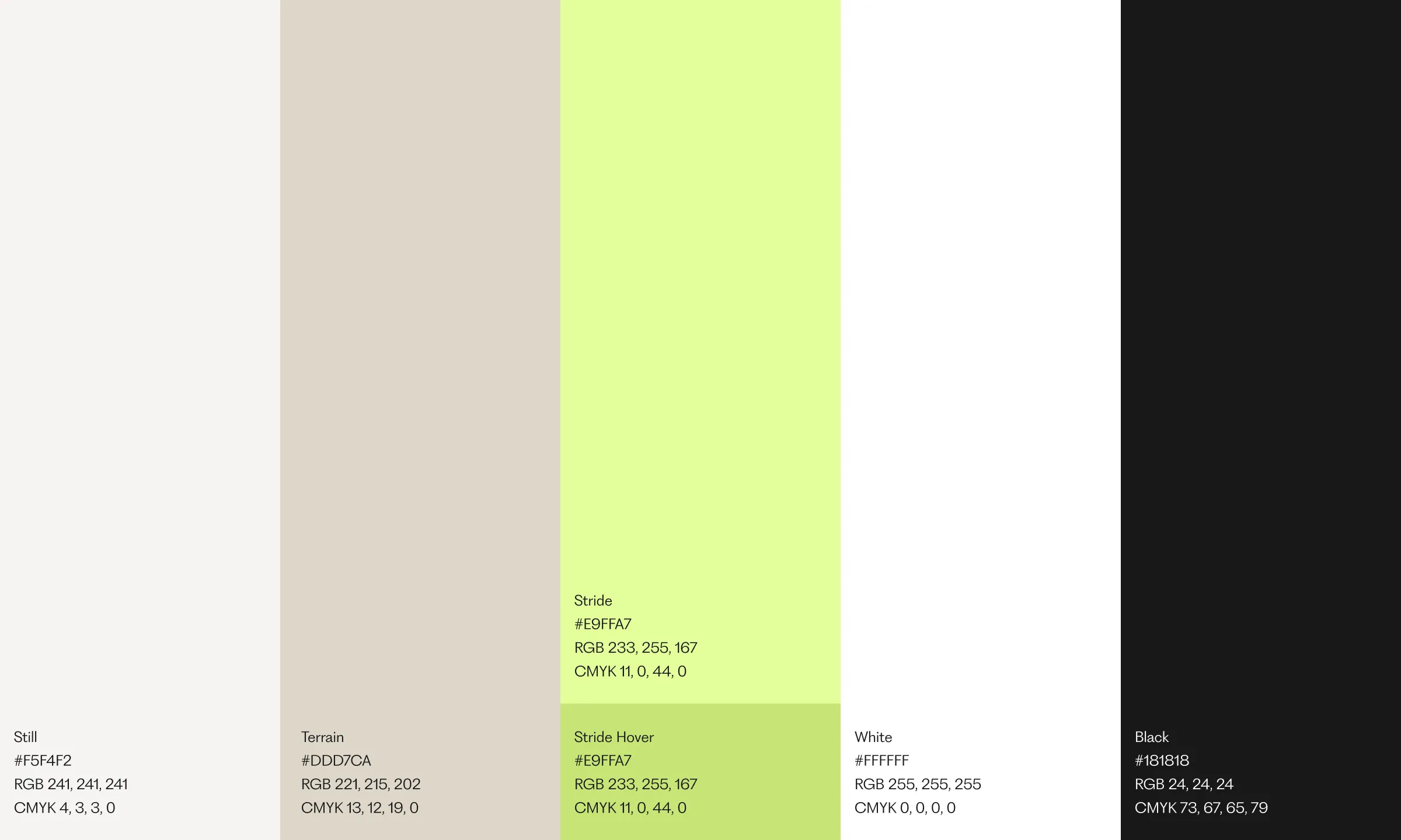
With the brand’s starting points already in place, our approach focused around polishing, elevating, and expanding the brand’s visual identity to support a robust, dynamic, and interactive brand environment. We maintained a clean, fresh aesthetic while injecting ownable design systems that translate cohesively across digital and IRL touchpoints alike. We complemented the brand systems with a set of merchandise assets to further expand the brand identity and enable Cortney and Esther to work with a strong set of tools as they build their business.
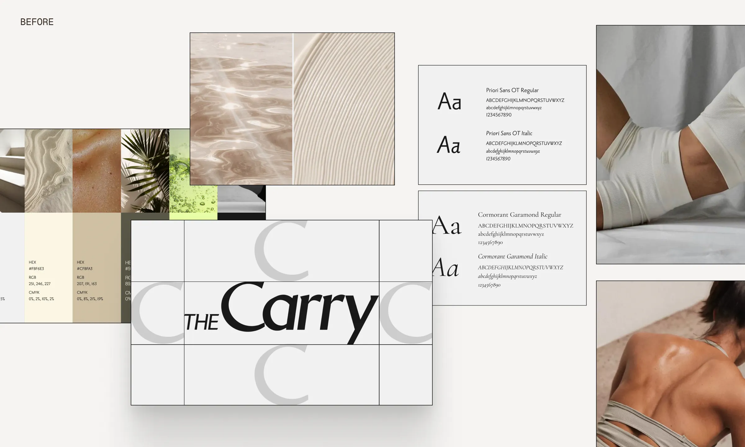
Before
When Cortney and Esther first reached out, they had the foundation of a great idea—but their early brand toolkit wasn’t quite keeping pace. The initial guidelines lacked cohesion, and the visual system needed refinement to fully support the bold, elevated presence they were after. From typography and imagery to logo use, our task was to bring polish, flexibility, and clarity across every touchpoint.
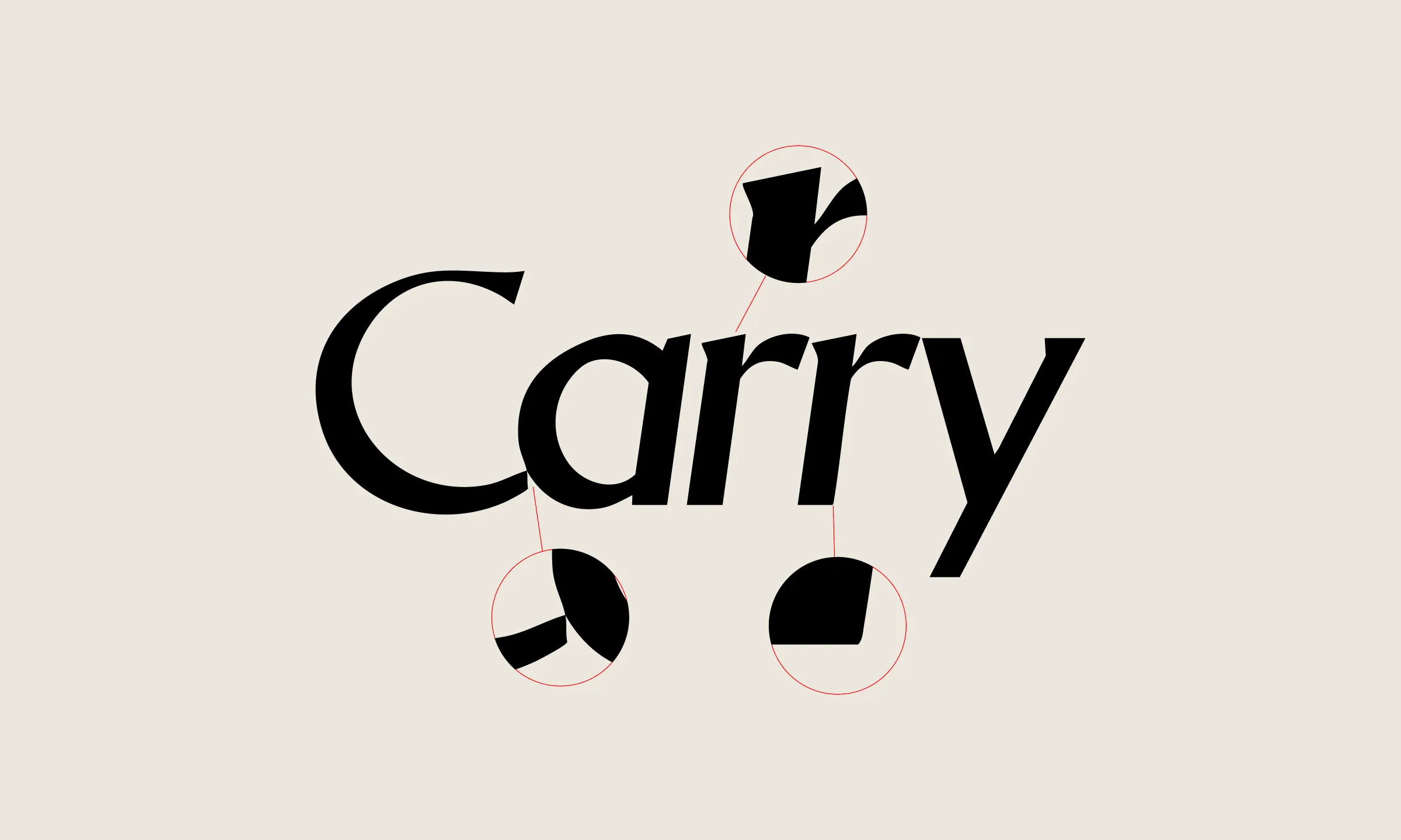
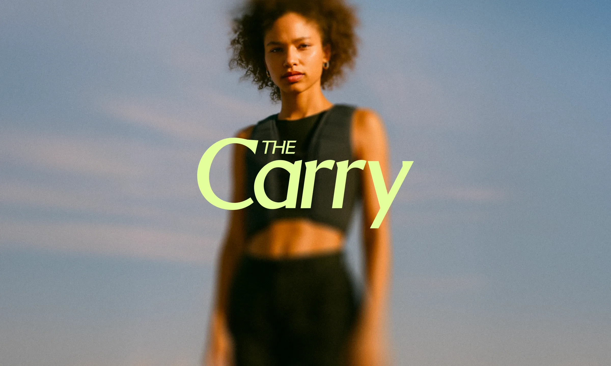
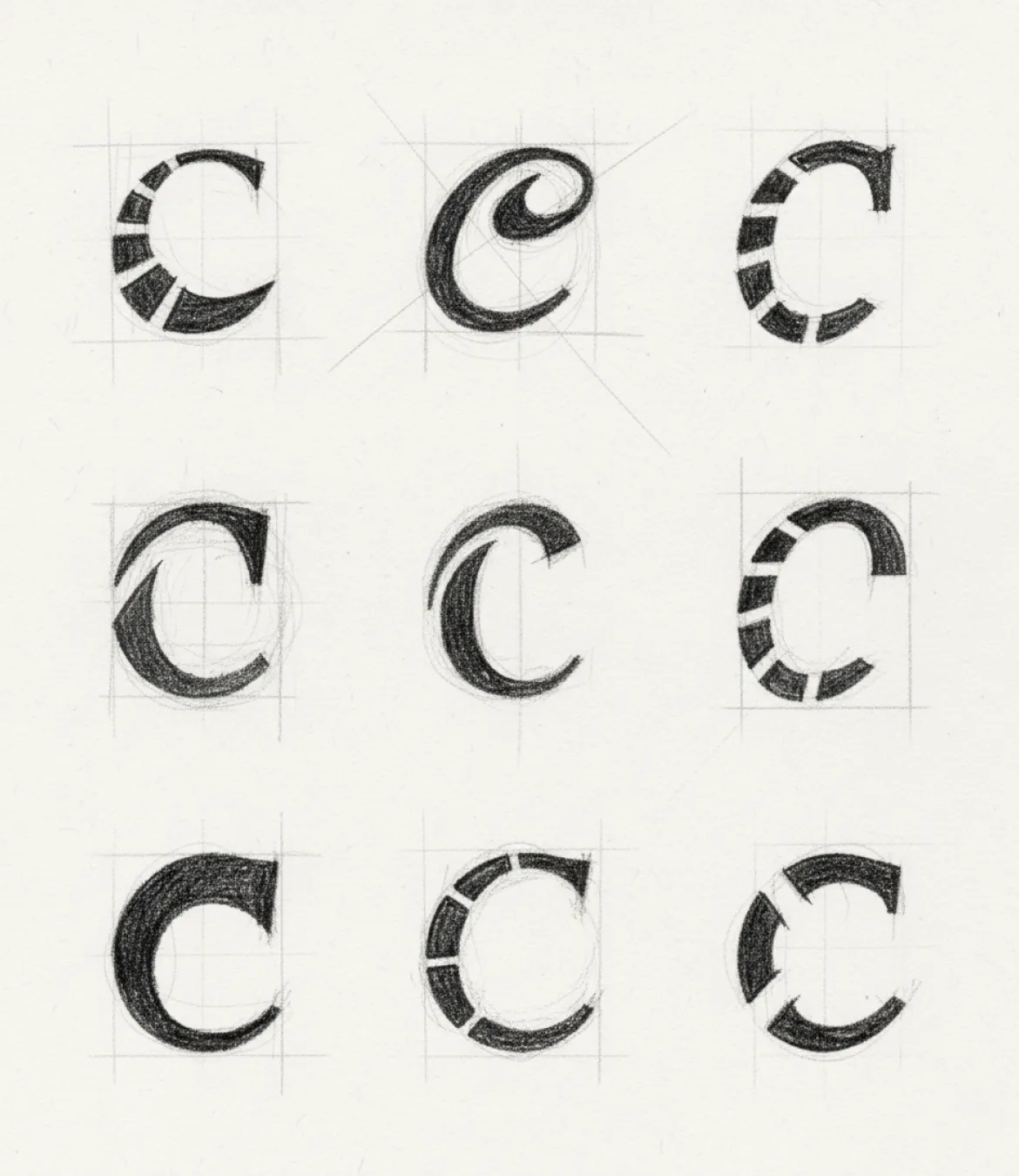
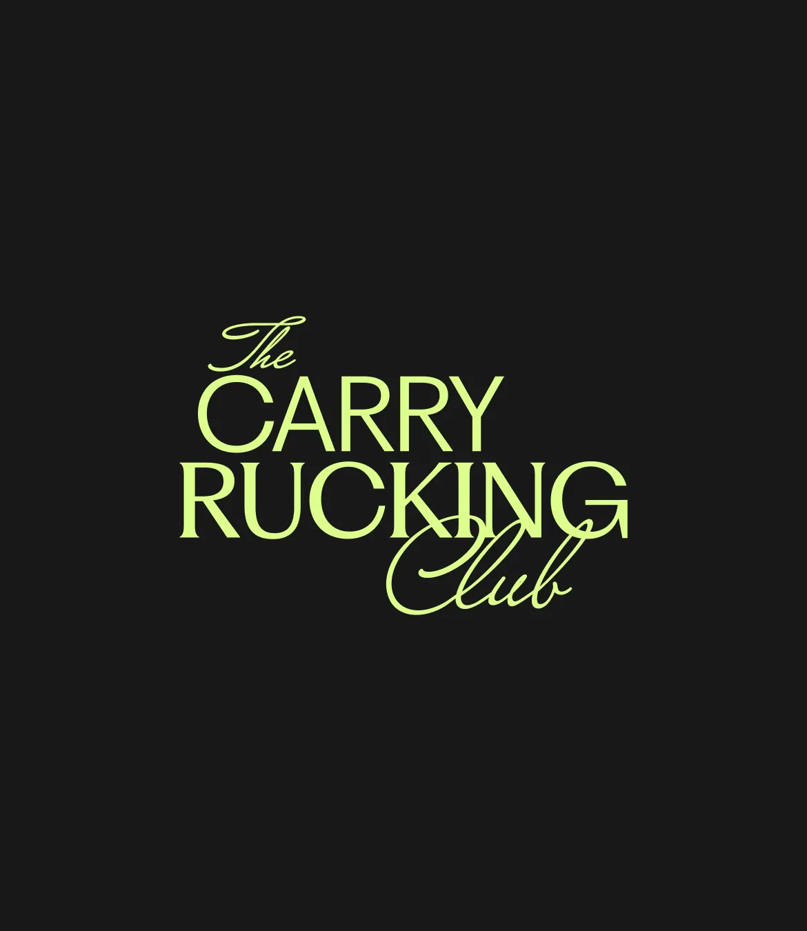
The original logo demonstrated some key areas to improve, notably, some wonky anchor points and inconsistent letterform structure. We redrew the wordmark from scratch, ensuring each letter was executed with balance and uniformity.
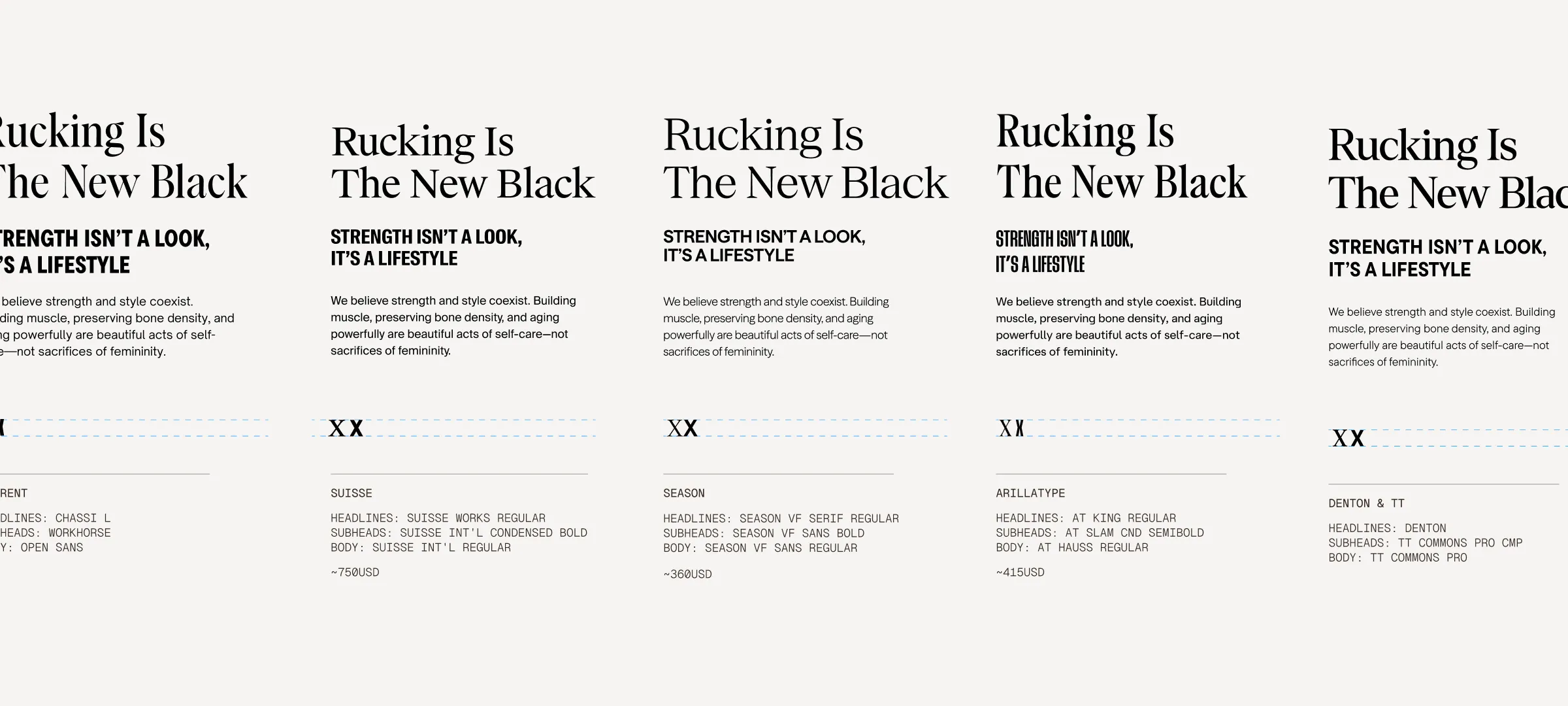
Typography
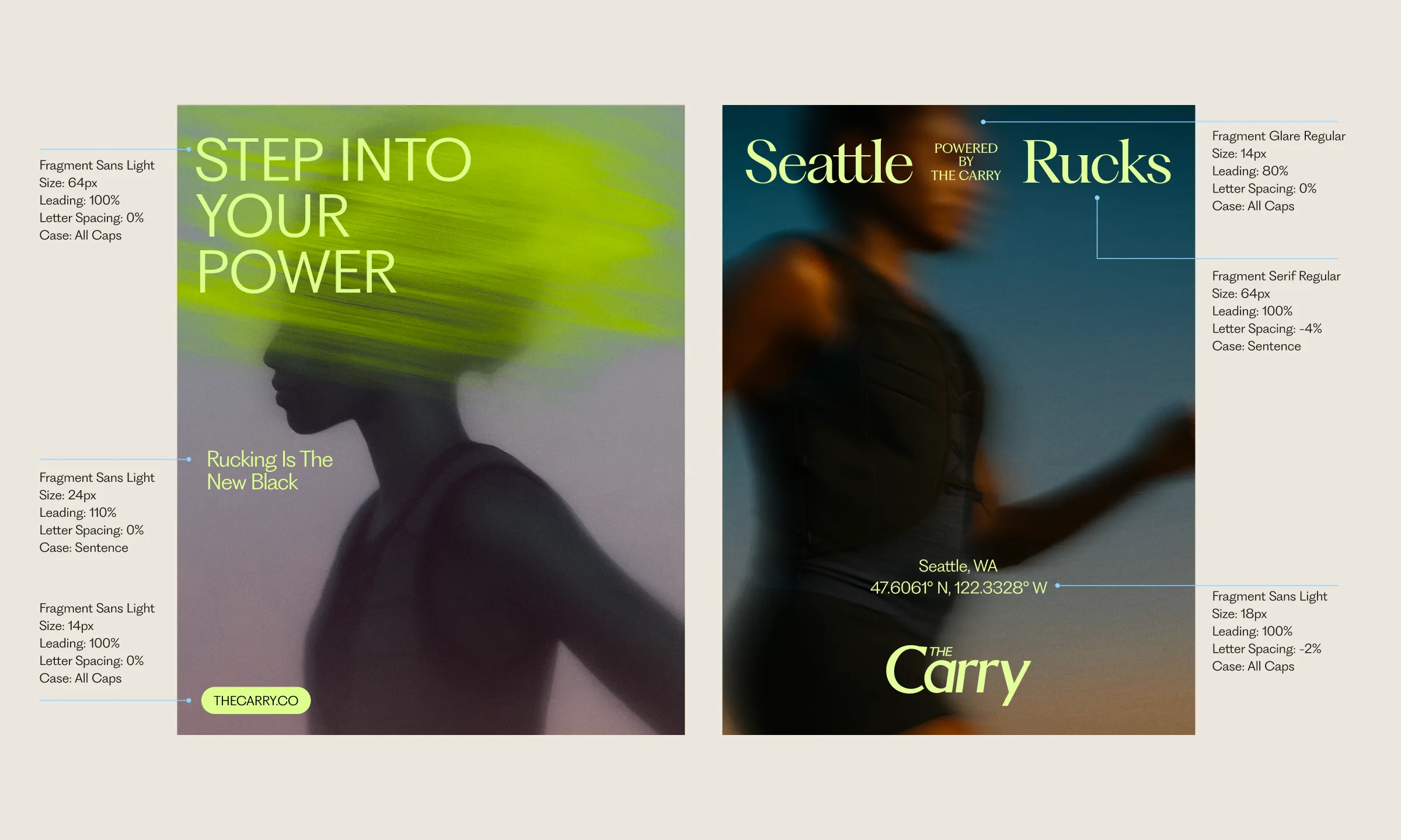
We explored options that could hold space for the full spectrum of the Carry woman: strength and softness, structure and freedom. We sought a system that would feel at home in both high-performance and lifestyle settings, while staying readable and distinct across formats. The Fragment collection by Pangram Pangram offered that balance: a cohesive trio of Sans, Serif, and Flare that together express the dimensionality of the brand’s voice.
Merch
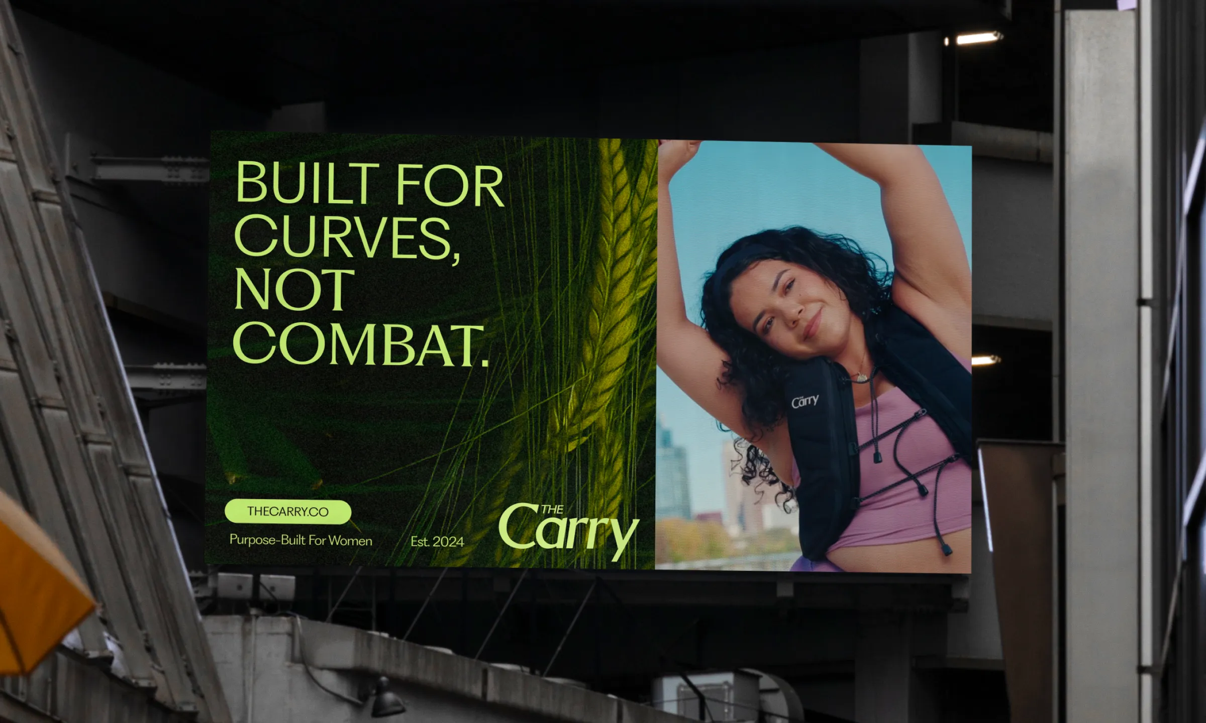
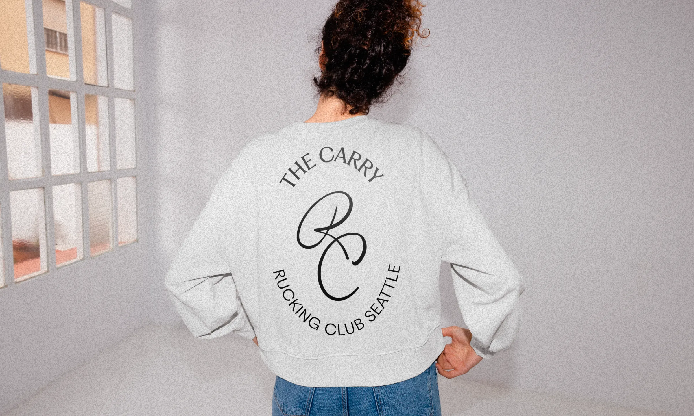
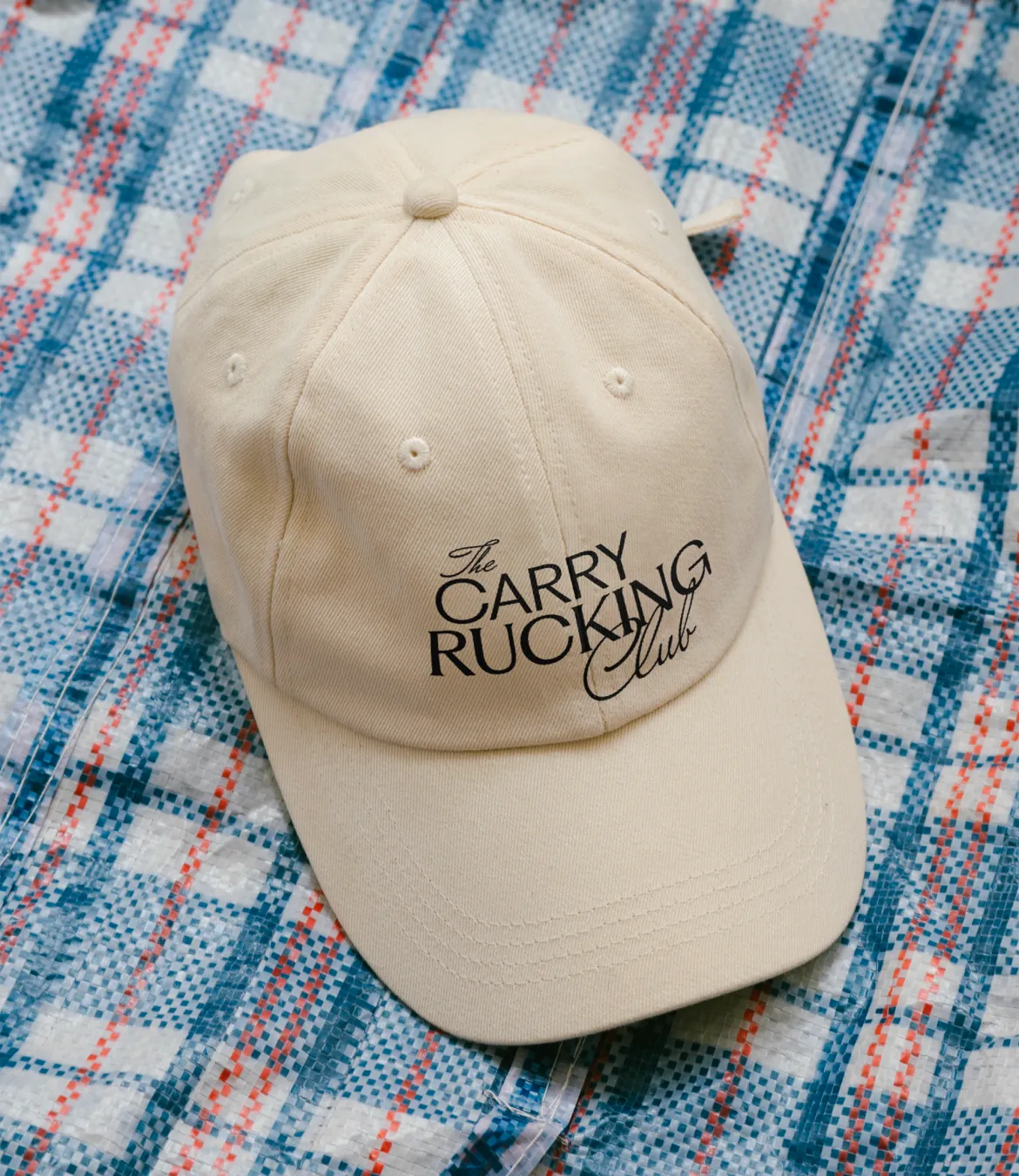
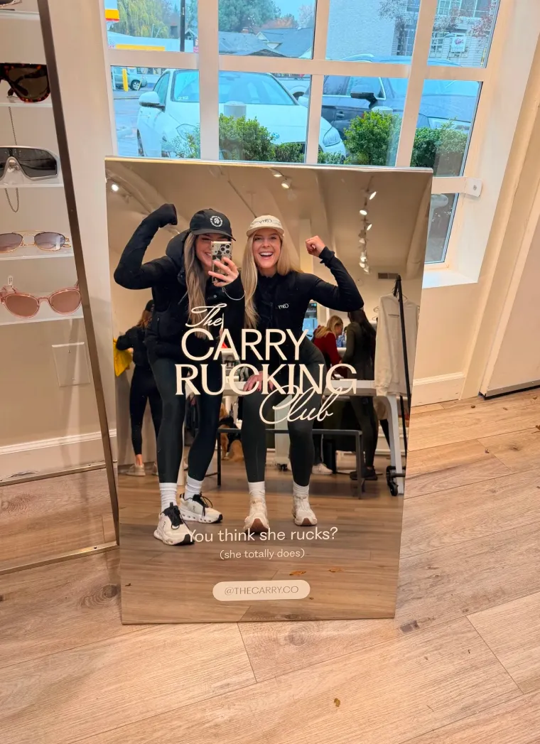
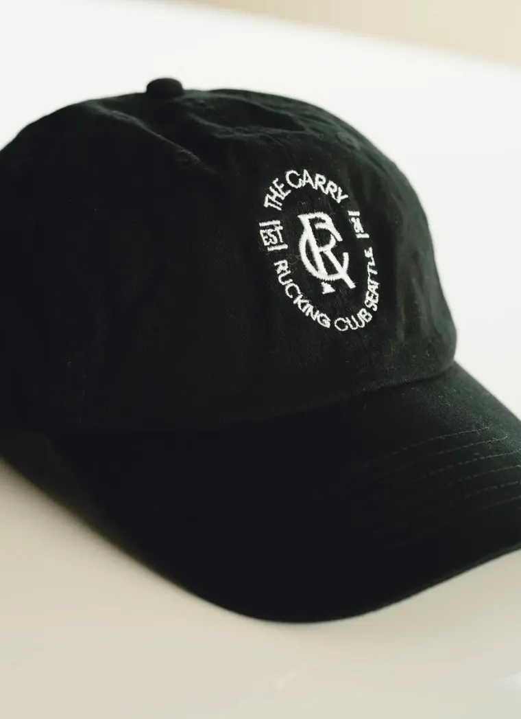
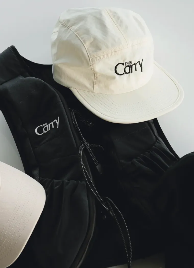
Merchandise played a key role in bringing The Carry community to life. With connection at the heart of the brand, we developed a series of crests and graphic marks designed to be worn, shared, and recognized—tools to help spread the word about rucking and create a sense of belonging. Each design was built to echo the brand’s values while giving the founders flexibility across formats and drops.
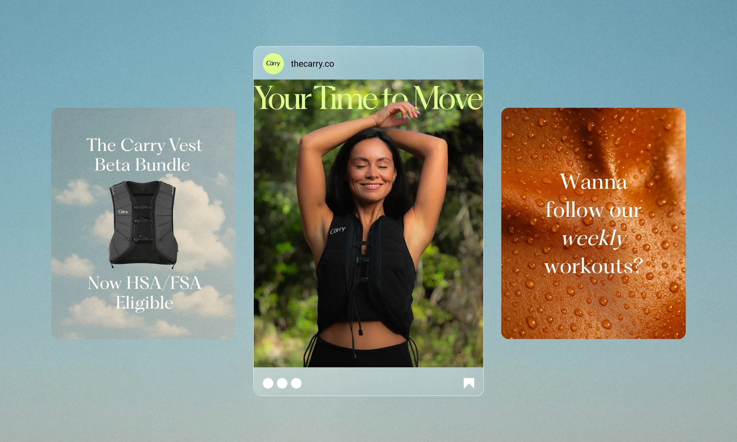
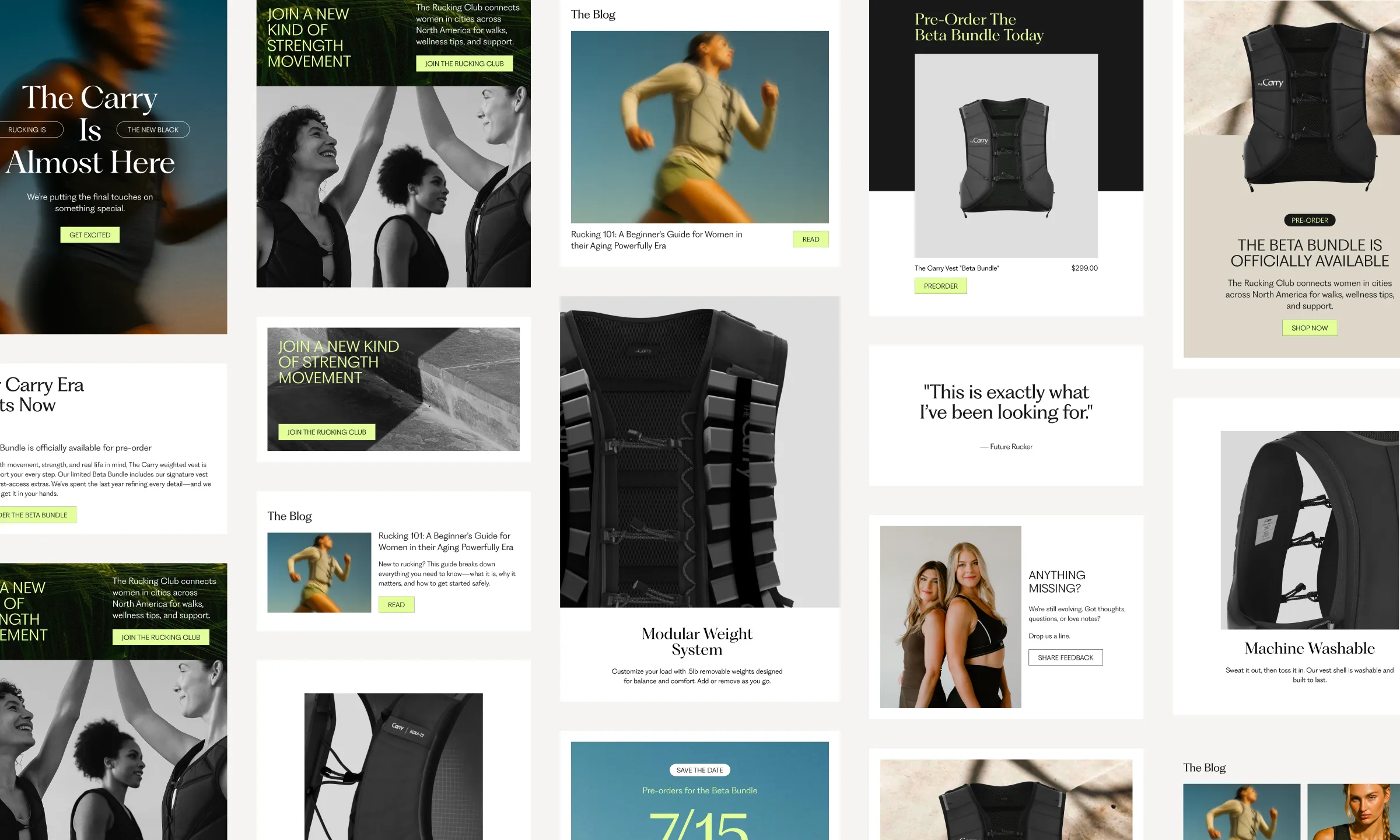
Digital
To support launch and beyond, we designed a modular email system made up of flexible blocks—hero banners, product features, blog highlights, CTAs, and more—that can be easily assembled in countless combinations. This approach gives the team freedom to create on-brand emails with ease, whether announcing a product drop, sharing a blog post, or spotlighting a community story. Every block was designed with clarity, hierarchy, and cohesion in mind to ensure consistent storytelling across every send.
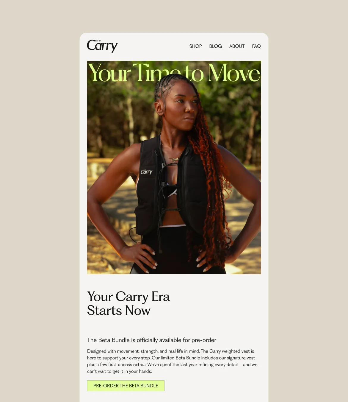
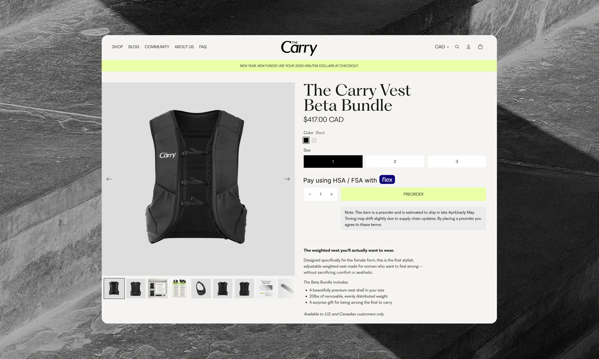
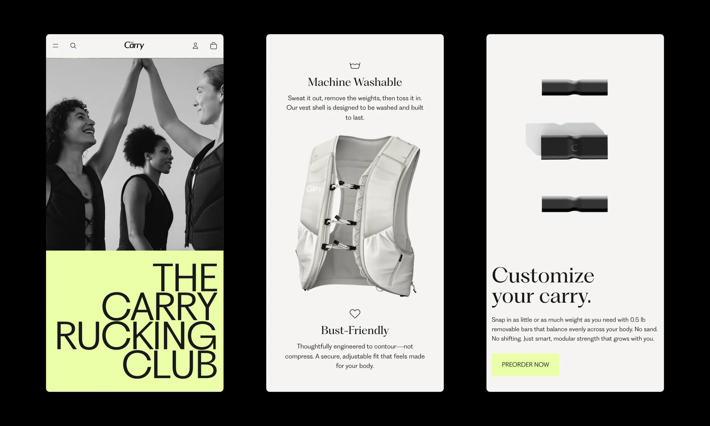
Website
We designed and developed The Carry’s Shopify site using Horizons, Shopify’s latest base theme—offering the team a flexible, scalable foundation to grow from. The build focused on storytelling, clarity, and conversion, with thoughtful sections that highlight product benefits, brand mission, and community momentum. From pre-order functionality to an integrated blog and email sign-ups, the site was designed to engage and convert from day one. Since launch, the brand has seen over 900 pre-orders and counting.